This is just a lovely piece of art for the cover.
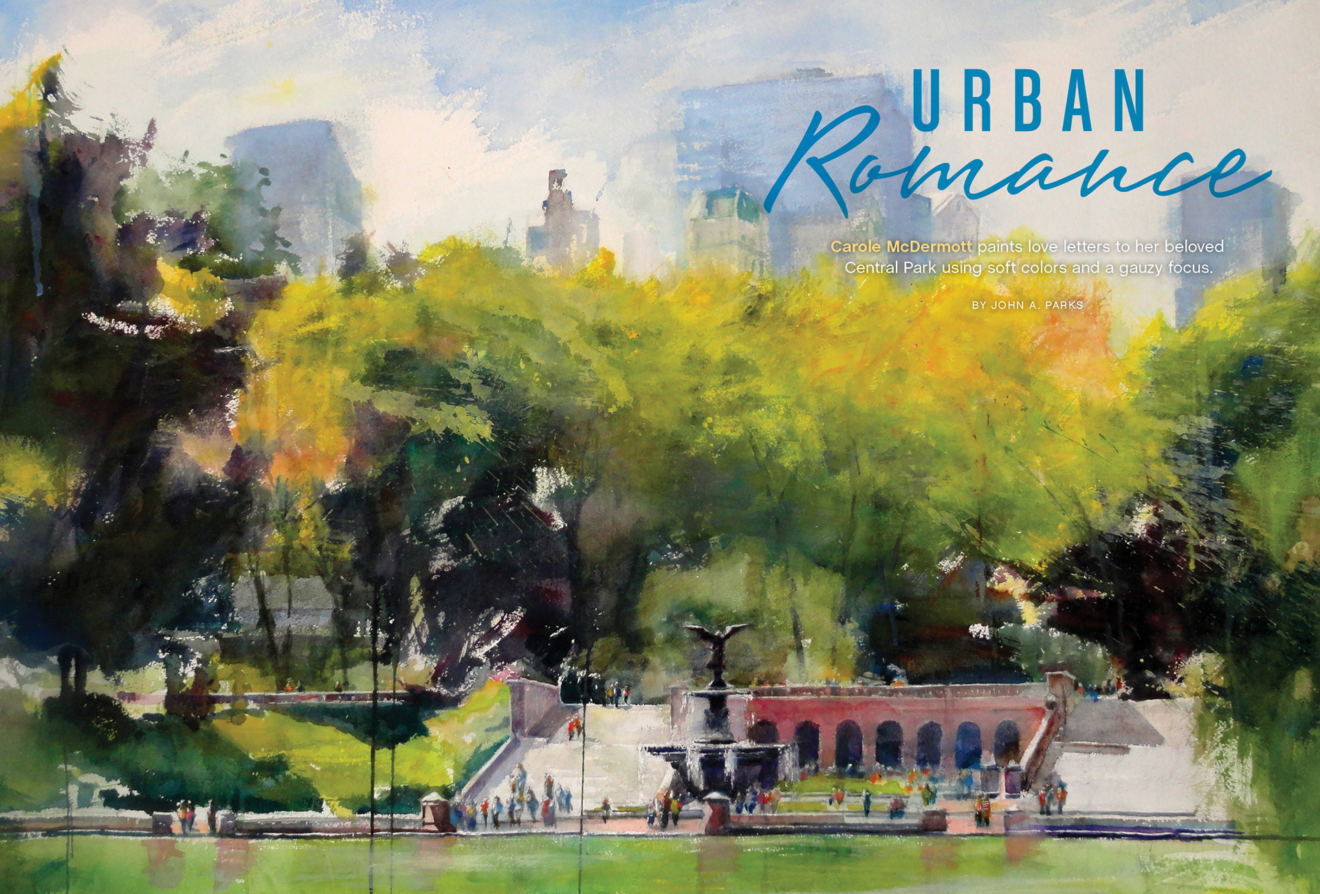
This is the full piece of art used on the cover. I liked the contrast of fonts for Urban and Romance.
This was one of the winners of the Watermedia Showcase. The black background was perfect for the magazine logo.
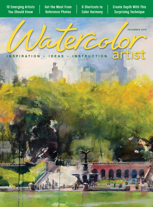
In December of 2016, the company moved to a contents style approach for the magazine covers. I worked with a design consultant to move our covers in that direction. This is the first of Watercolor Artists revised covers.
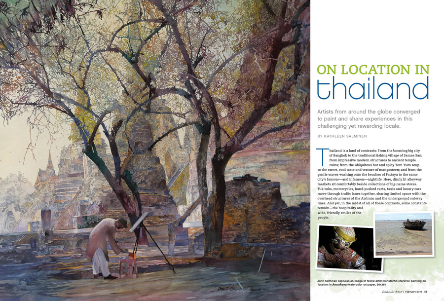
This is the opening spread for a travel style article. Location photos were interspersed through the article, while finished art inspired by the location were showcased large.
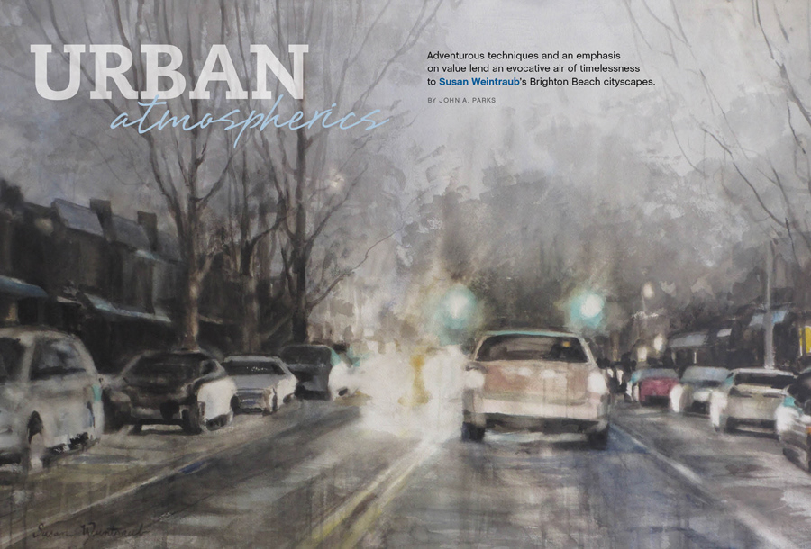
Urban scenes are popular with watercolor artists. Where possible, I run art full bleed.
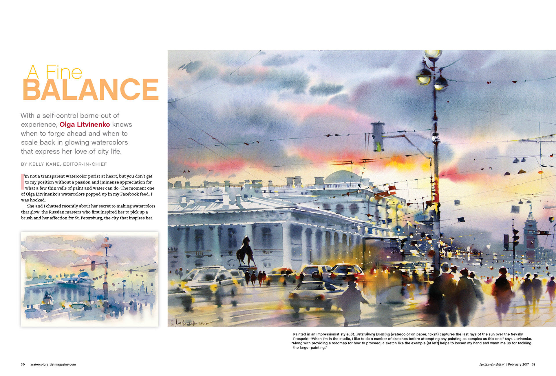
The artist for this article provided us with a number of sketches that she'd created onsite. I used those throughout, matching sketch with final.
The artist for this does lots of lovely, loose watercolors. I contrasted with a head treatment that was modern and sleek.
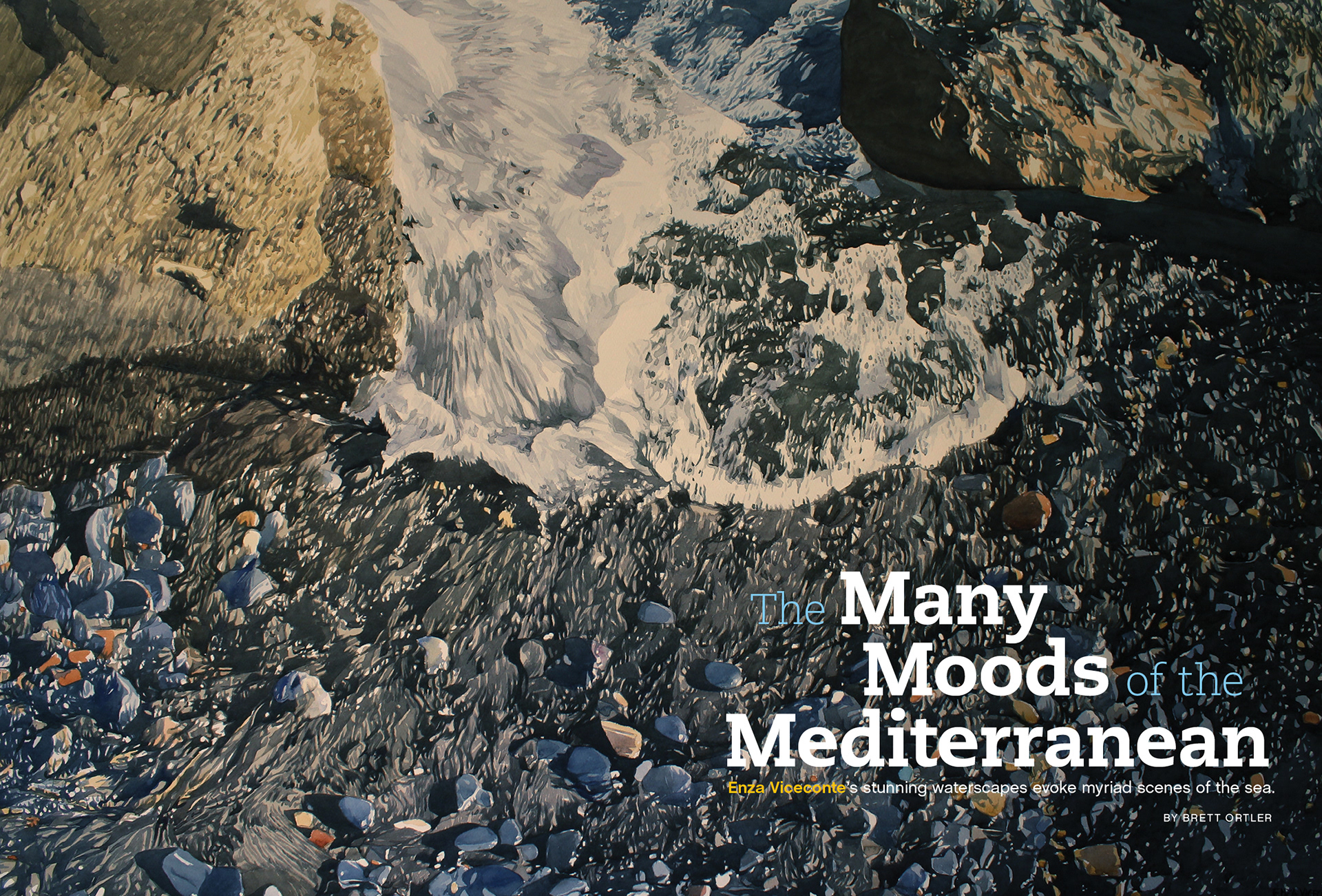
I enjoyed the repetition of the letter M on this one, also incorporated some blue and yellow to hint at the location.
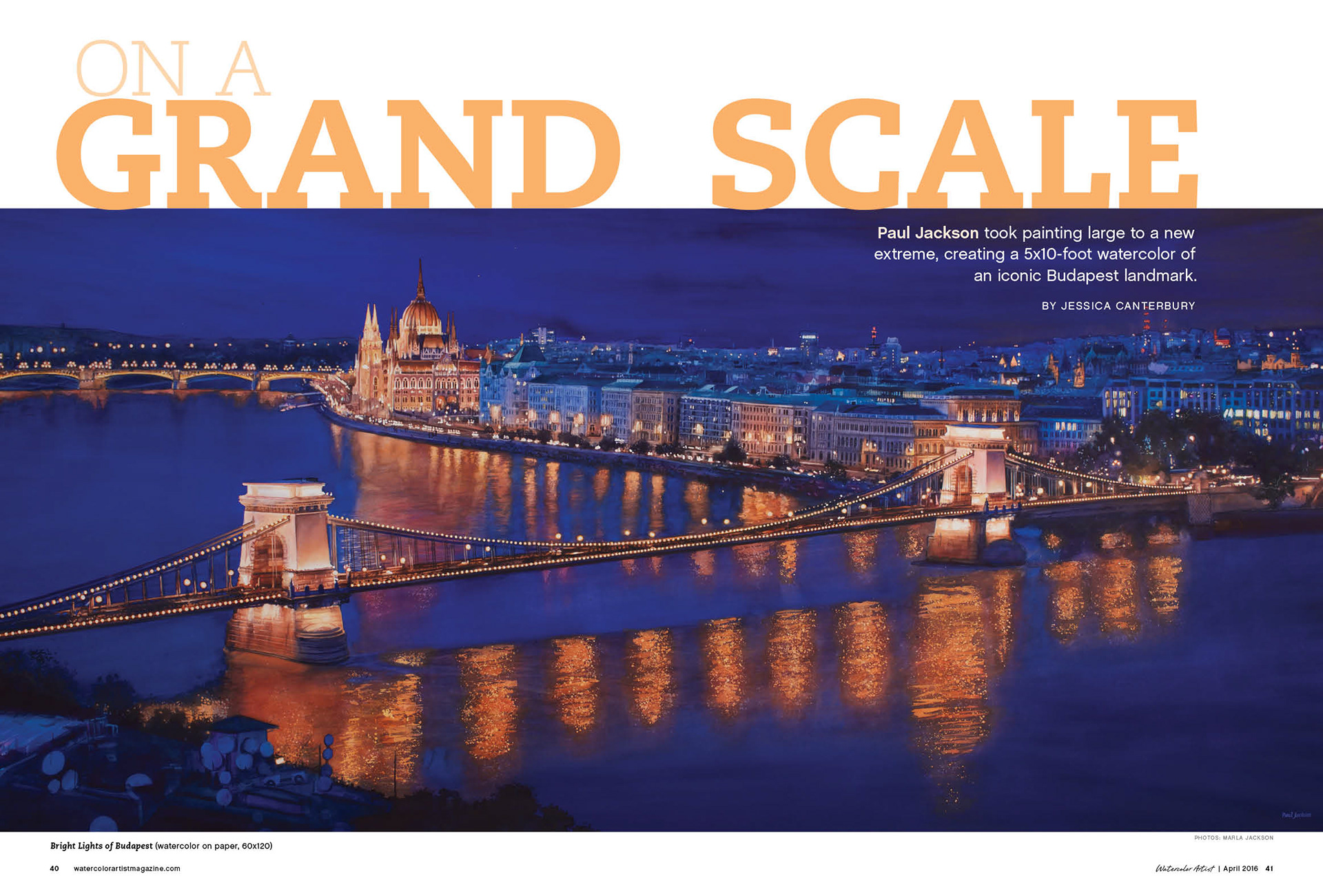
Great article on painting large scale, so I ran the head large and chunky.
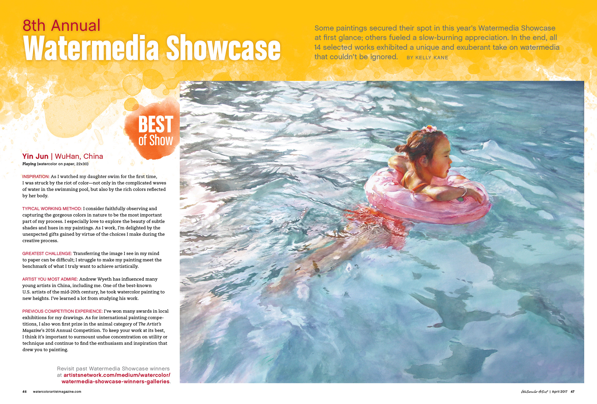
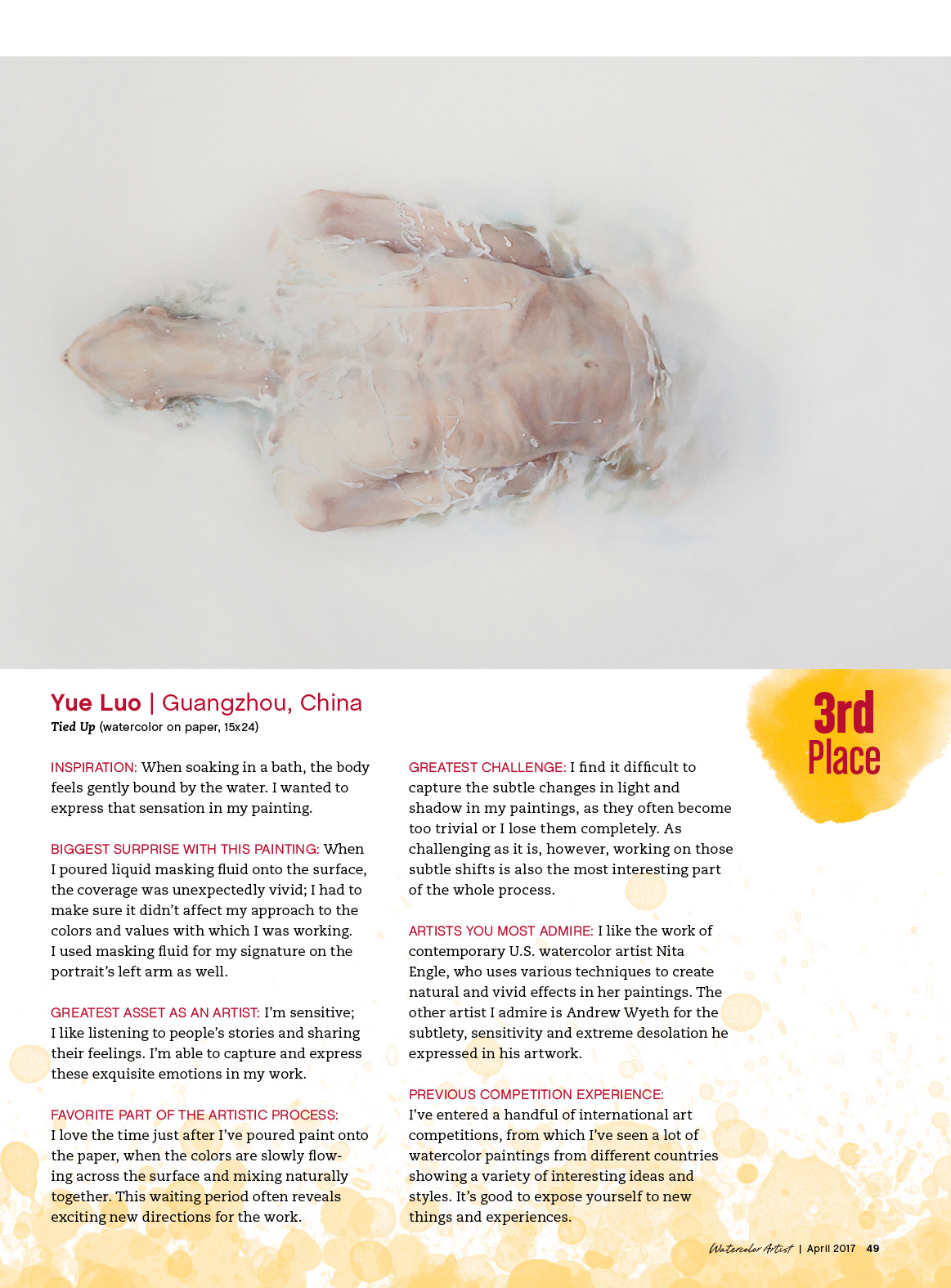
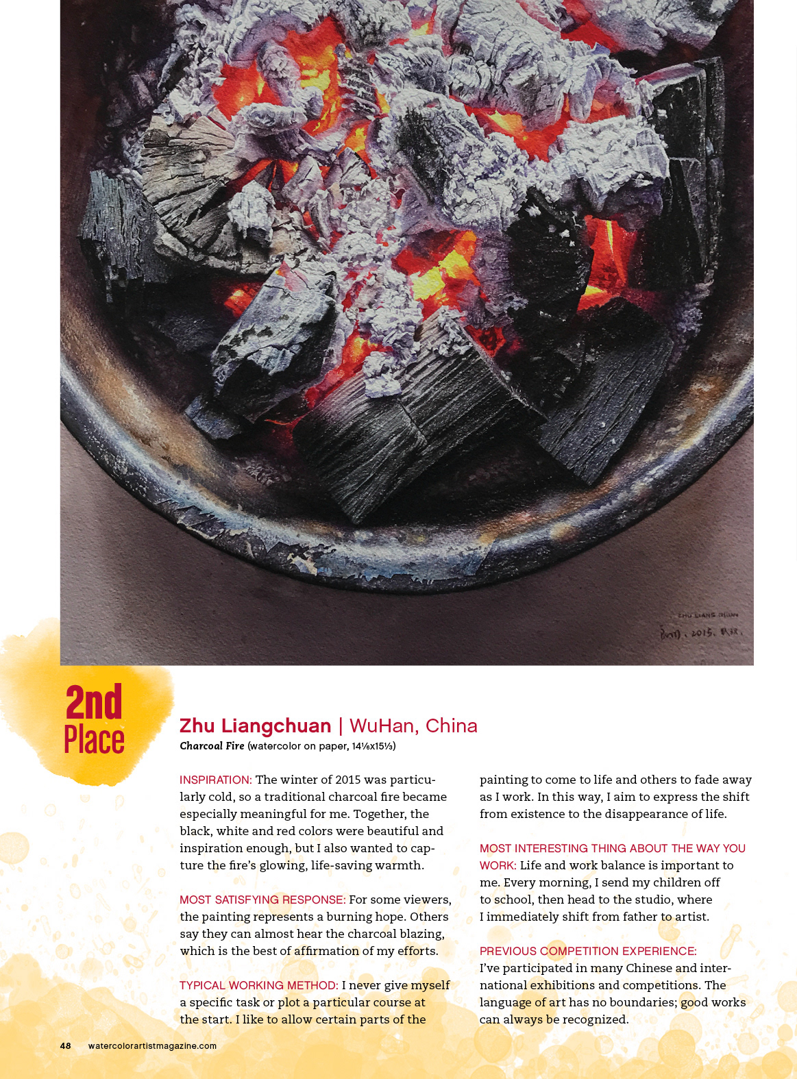
These three layouts are from the 8th Annual Watermedia Showcase. The challenge is in using limited space to show the art large, but leaving enough space for the interview.