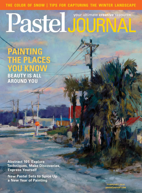
This was the first cover I did for Pastel Journal. We loved the pop of orange-red on the stop sign.
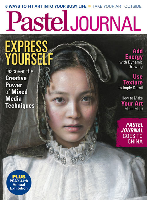
In December of 2016, we worked with a design consultant to re-envision our covers for newsstand. We moved to a content style approach and this is the first cover for Pastel Journal to go through that process.
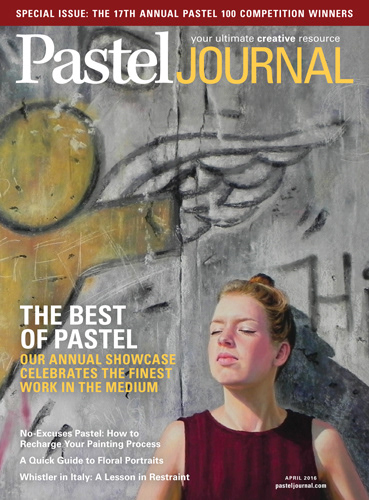
This piece was one of the honorable mentions for the Pastel 100 competition. Original is horizontal, but the crop was great for the cover. It felt inspirational to me.
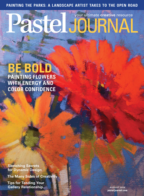
This cover had the best newsstand sell through for 2016. I think it's the color.
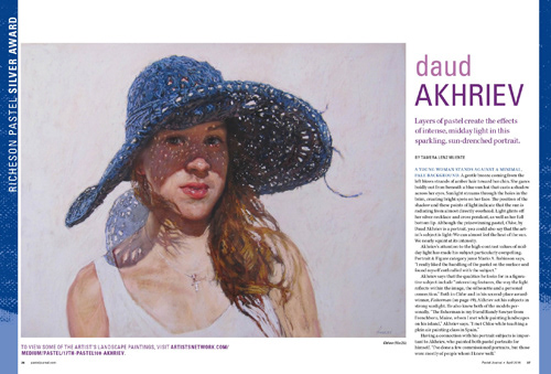
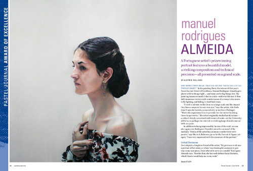
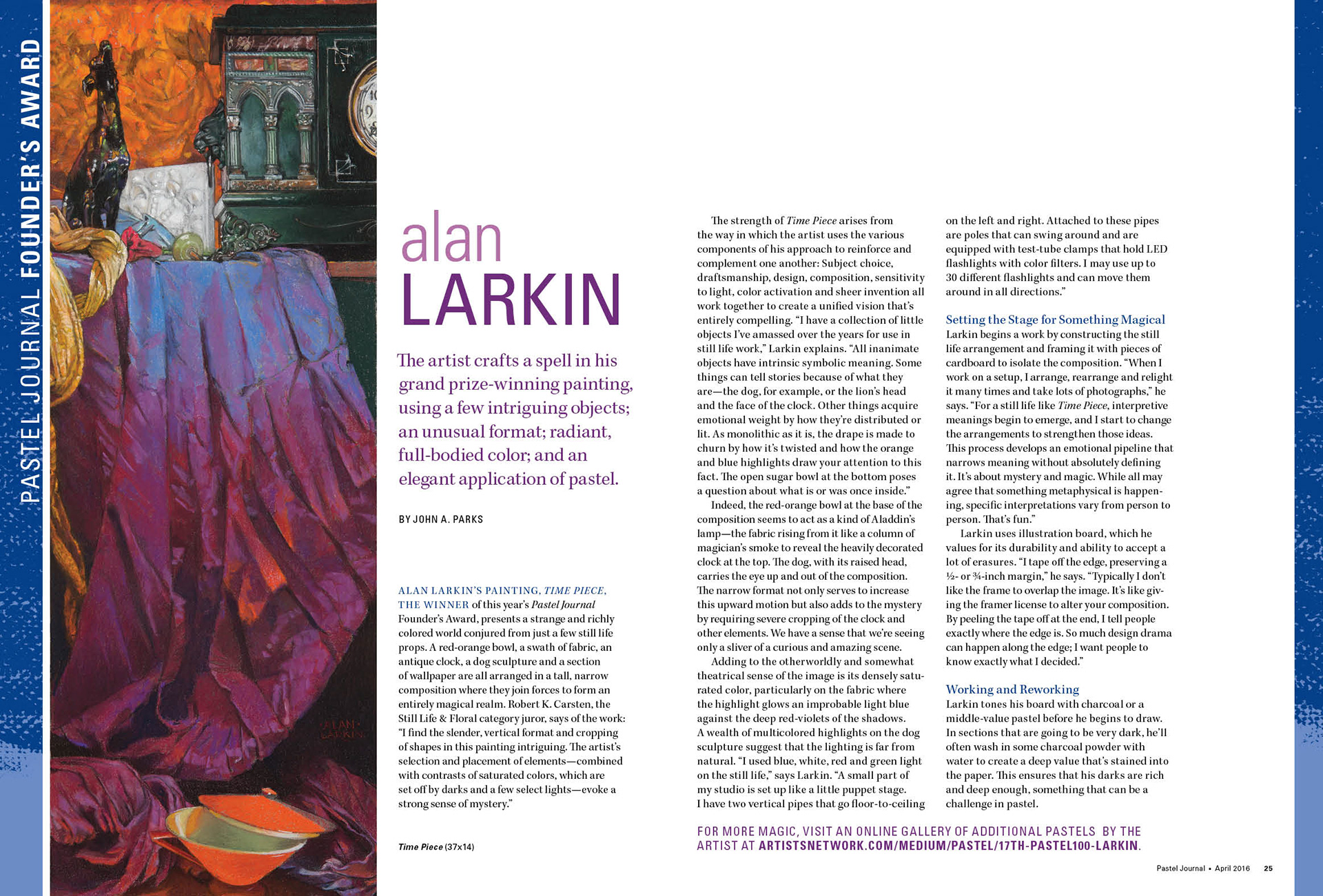
These three layouts are from the opening spreads for the winners of each major award for the Pastel 100. Larkin's was a particular challenge due to the extreme composition of his work.
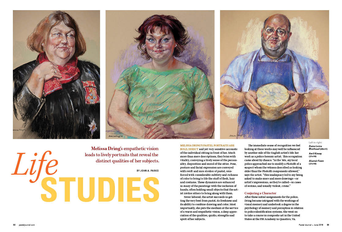
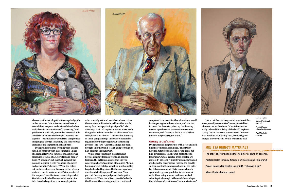
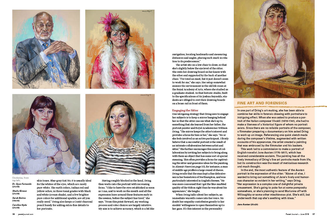
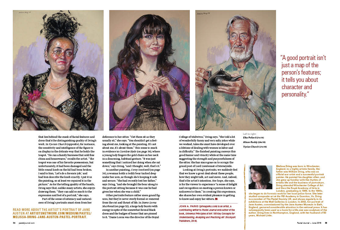
This is the layout of the entire article for Melissa Dring. Her unique portraiture lent itself, I think, to a repetitive layout so that the readers could see the similarity of composition but the uniqueness of each subject.
I liked the color and text composition on the headline for this one.
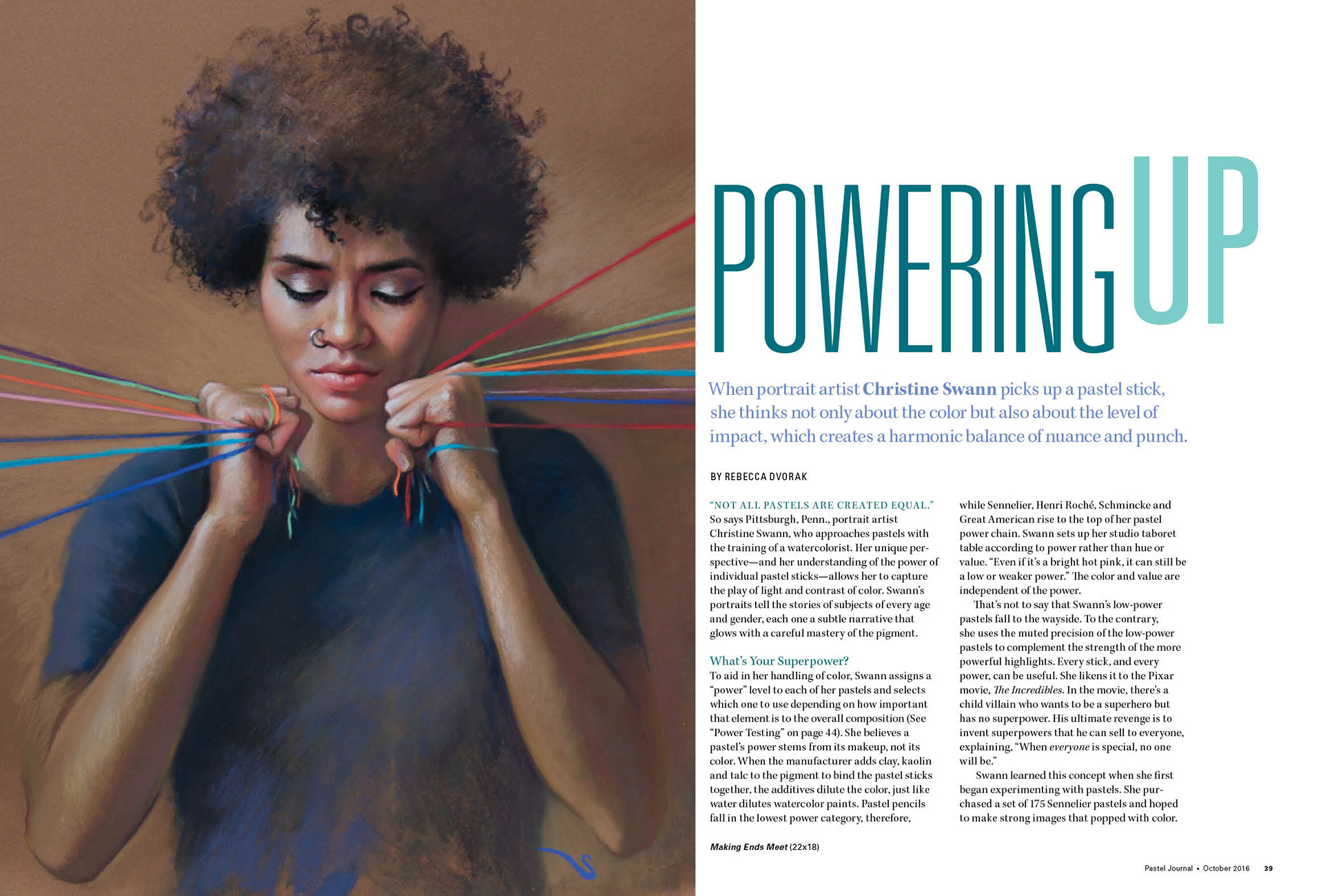
Obvious play on the word "up," but still fun.